Embracing a Blank Canvas with Pantone’s Color of the Year
Written by Arbitrage • 2025-12-12 00:00:00
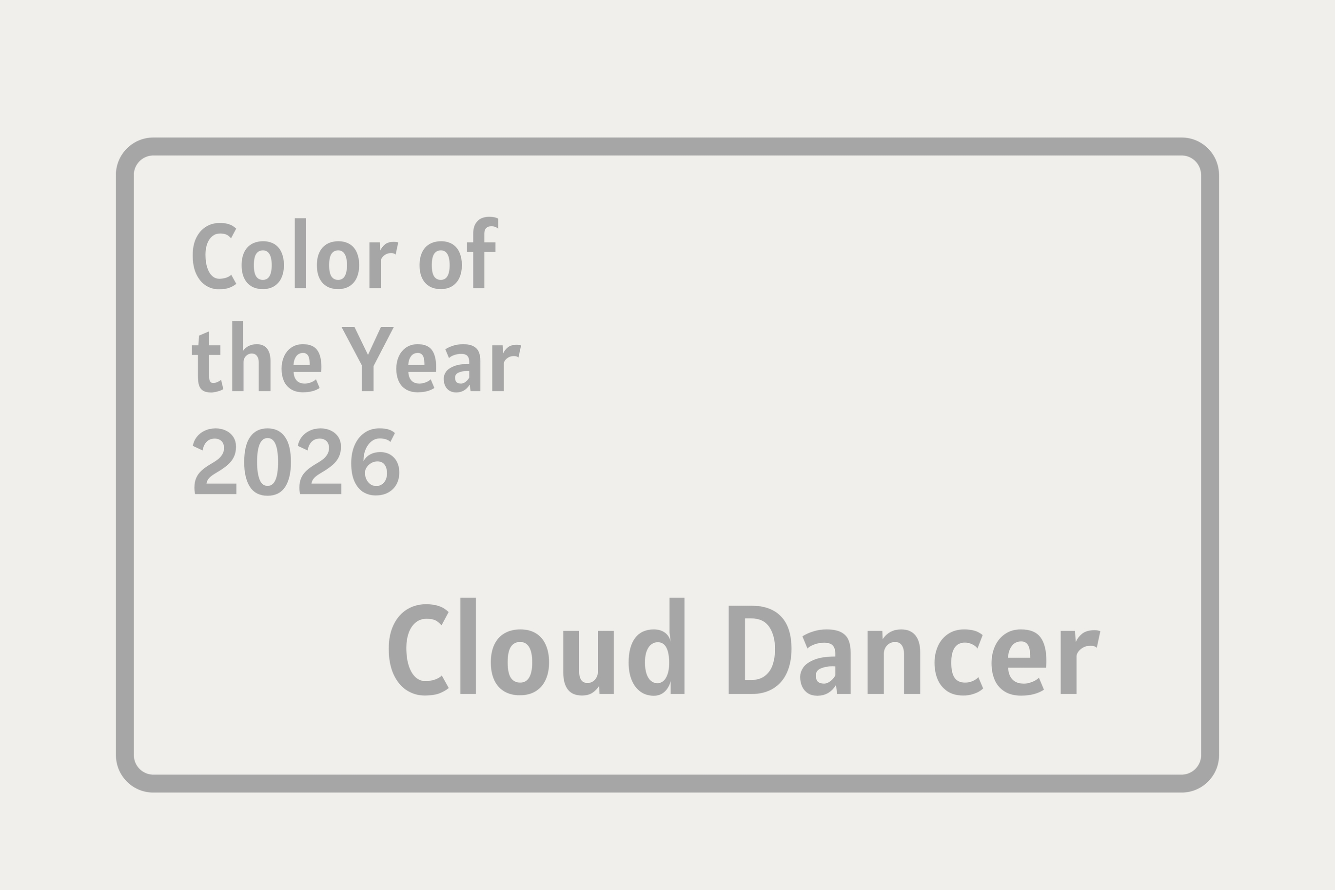
Each December, the design world braces itself for the reveal of the next "Color of the Year." But this year, Pantone's decision for 2026 - a soft, airy white named Cloud Dancer (Pantone 11-4201) - caught many off guard. For the first time in the initiative's history, white takes center stage.
The roots of the program go back to 1999, when Pantone introduced the idea of selecting a "Color of the Year" to mark the upcoming new millennium. The first chosen hue was Cerulean, which was a soft blue inspired by the sky, symbolic of optimism and a fresh start. What began as a one-time statement has blossomed into an annual ritual. Since 2000, experts at the Pantone Color Institute have convened to analyze global and cultural trends, considering influences from fashion, interior design, art, film, and technology. Societal moods and even broader social or economic shifts also have an impact on the committee's choice. As Pantones put it, the Color of the Year is designed "to engage the design community and color enthusiasts... in a conversation about color."
In the announcement on December 4, 2025, executive director of the Pantone Color Institute Leatrice Eiseman described Cloud Dancer as "a billowy white imbued with serenity," which offers "a calming influence in a society rediscovering the value of quiet reflection." Rather than making a bold, attention-grabbing statement like a vivid magenta or electric blue, Cloud Dancer is meant to be similar to a blank canvas that encourages quiet renewal, re-centering, fresh thinking, inner calm, and creative breathing space. In a world many feel is overstimulated and chaotic, this nearly-white tone can offer simplicity, clarity, and a gentle, airy minimalism. Pantone is inviting designers to build on the neutral white. An article in Women's Wear Daily said that the shade can "provide scaffolding for the [entire] color spectrum." Pantone recommends pairing Cloud Dancer with bolder accent colors or letting form, texture, and shape become the focus of a space.
Pantone's 2026 color decision has not been universally embraced. Forbes quoted critics who argued that naming a white shade during a moment of heightened social tension (especially around race and identity) feels tone-deaf, regardless of Pantone's stated intentions. Articles in The Guardian, Glamour, and Architectural Digest dismissed the choice as boring or emblematic of design fatigue, with some labeling it a "colorless recession indicator." An article in People quoted readers with questions as to whether white even counts as a "color."
Still, supporters argue that the ambiguity and subtlety of Cloud Dancer is its strength: a quiet mood that encourages introspection, calm, and a fresh start. Pantone's hope is that even if people disagree, the color will spark conversation about where we are and where we want to go.
Colors are more than just aesthetic choices. They carry emotional weight and can guide mood and meaning. Through the Color of the Year program, Pantone helps give shape to what collective feeling or need may resonate next. The message from Pantone seems to be maybe what we need next isn't boldness; maybe it's quiet and reflection. Look for Cloud Dancer during 2026 as several companies have lined up for collaborations, including Motorola, Mandarin Oriental, Play-Doh, Post-it, Command, Pura, and Joybird.