The Midterm Year Pattern: What the Election Cycle Says About Stocks, and Why the Dollar Won't Play Along - Part 1
Written by Arbitrage • 2026-07-14 00:00:00
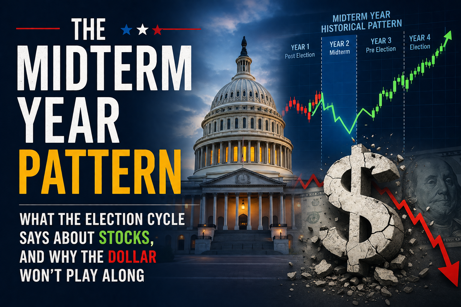
Every four years the US market runs through the same calendar rhythm, and 2026 sits on the part of it that traders tend to circle. It's a midterm election year, the second year of the presidential cycle, and historically it's been the roughest stretch of the four for equities and the one that's set up the cleanest recovery. The dollar's a different animal, and that difference is worth understanding before you lean on any of this.
The framework goes back to Yale Hirsch and the Stock Trader's Almanac. Split a presidential term into four years: post-election, midterm, pre-election, and election. Each has tended to carry its own return profile. The pre-election year has been the strongest on average. The midterm year has been the weakest. That's the phase we're in now, and it's also the phase with the most distinctive shape to it.
The equity pattern: weak early, strong late
This is the part with the most history behind it. Since 1871, the S&P 500 has averaged roughly 3.3% in midterm years, against about 6.4% across all years. Narrow the window to the modern era and the gap widens. Since 1970, midterm years have printed close to flat on average while all years averaged north of 9%. The index has also finished higher less often, closer to 58% of the time versus 65% in a typical year.
But the calendar-year number hides the real story. The tendency is front-loaded weakness and back-loaded strength. Peak-to-trough declines during midterm years have averaged around 17% since 1950, usually starting in late spring and finding a floor somewhere between mid-August and October. Volatility runs hot through that stretch too, with return dispersion since 1970 sitting closer to 16% in midterm years against 13% otherwise. The rough patch and the elevated volatility have tended to cluster in the same window, ahead of the November vote.
The midterm low, and why it gets attention
Here's the part traders actually care about. That mid-year drawdown has, more often than not, acted as a springboard rather than the start of something worse. Measured from the midterm low to the following pre-election year's high, the Dow has averaged roughly 46% since 1914. On the S&P 500, the recovery a year off the midterm low has averaged around 32%. The window running from the fourth quarter of the midterm year into the first half of the pre-election year has been one of the more consistent stretches in the whole cycle. None of that guarantees a repeat, but it's why the midterm low tends to get treated as a pivot worth watching rather than just another drawdown.
Why the pattern tends to show up
No seasonal is worth much without a mechanism behind it, and this one has a few that recur. Uncertainty is the obvious one. Markets don't love not knowing who'll control Congress, and the president's party has lost House seats in almost every midterm, an average of about 27 seats across the last 23 cycles. Once the vote clears, that uncertainty tends to lift regardless of who wins. There's a policy and liquidity angle as well. Stimulus, both fiscal and monetary, has tended to ramp heading into the presidential election, and money supply growth has historically troughed around October of the midterm year before accelerating. Those forces give the pattern something to stand on, even if they're never certain to repeat.
Come back tomorrow for Part 2 of this topic!
This content is provided by Arbitrage Trade for informational and educational purposes only. It's market analysis and pattern recognition, not investment advice, and nothing here is a recommendation to buy, sell, or hold any security. All examples are illustrative. Historical patterns and averages describe past tendencies across a sample of observations and don't predict or guarantee future results. Any figures referenced are approximate and drawn from third-party historical data. Do your own research and consult a licensed professional before making financial decisions.